
Theme Showcase
Twenty-one ways for it to stop looking like software.
Clinical software is famous for being gray. Yours does not have to be. Twenty-one themes, light and dark, set per person, and all of them on every plan.
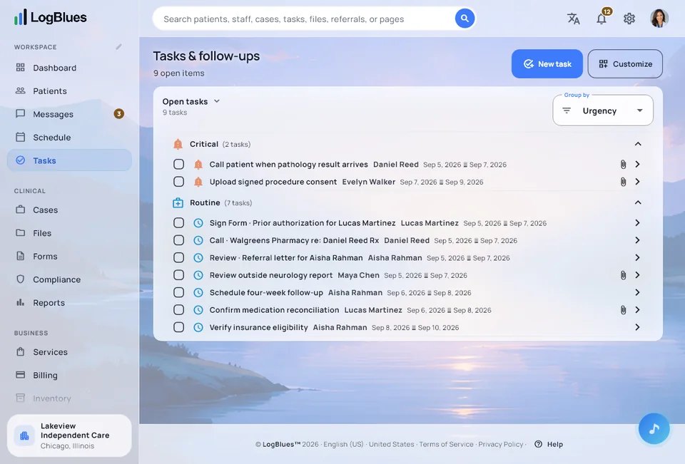

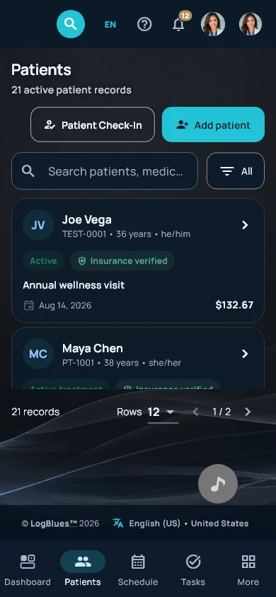
Every screen
One workspace, whatever it is running on.
The same software at every size — a big monitor at the front desk, a laptop in the office, a phone in your pocket. Three different themes here; there are twenty-one.
Windows 10 and 11 Light & dark Twenty-one themes
The collection
All twenty-one.
Below is the artwork each theme paints behind your workspace — the real files, at real color, with the accent the app uses beside the name. It is the artwork rather than a screenshot of every theme in use, because twenty-one mocked-up interfaces would be twenty-one pictures of software that does not exist. Every theme comes in a light version and a dark version, because if we are nothing else, we are thorough.
Why we bothered
This is not a frivolous feature.
It sounds like one, right up until you have looked at the same gray screen for nine hours. People use tools they do not dread, and a clinic runs better when the software is not the worst part of the day. That is the whole bet, and the themes are the most visible place we made it.
No theme is another theme with a tint applied — each one has its own palette and its own imagery, light and dark both, following your system if you would rather not choose.
All twenty-one come with every plan, the Founders Edition among them, and that includes the free two months. Pick one, change it whenever you like, and let each person pick their own.
We planned to keep fourteen of these behind the Premium plan, and the site said so for a while. We changed our minds: every theme comes with every plan now, because a theme was never a reason to buy or not buy the software.
Start free See LogBlues →The same workspace, four ways
One clinic, multiple moods.
The same dashboard, the same data, the same day. Only the theme changes, and each one carries a light and a dark version.
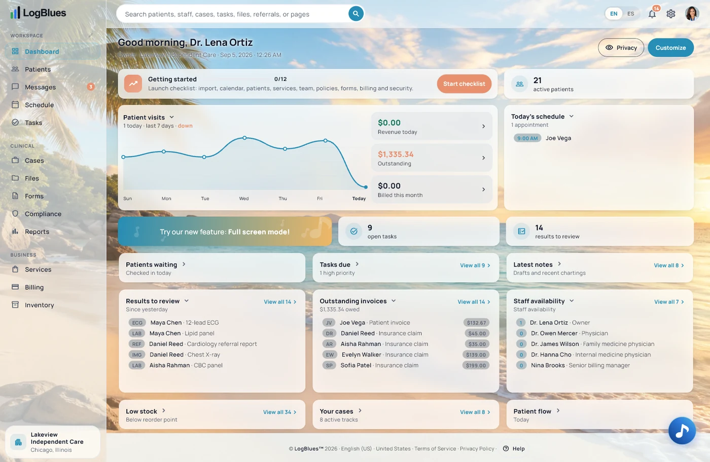
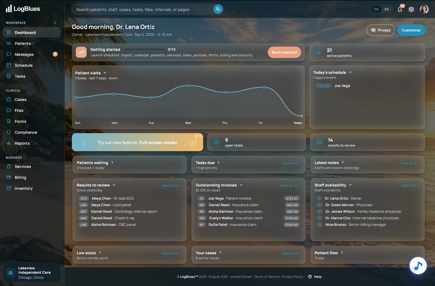
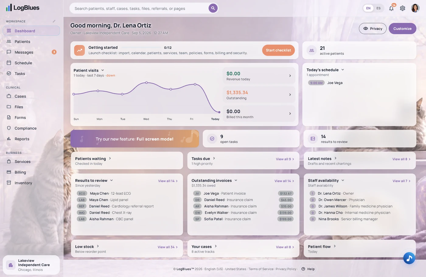
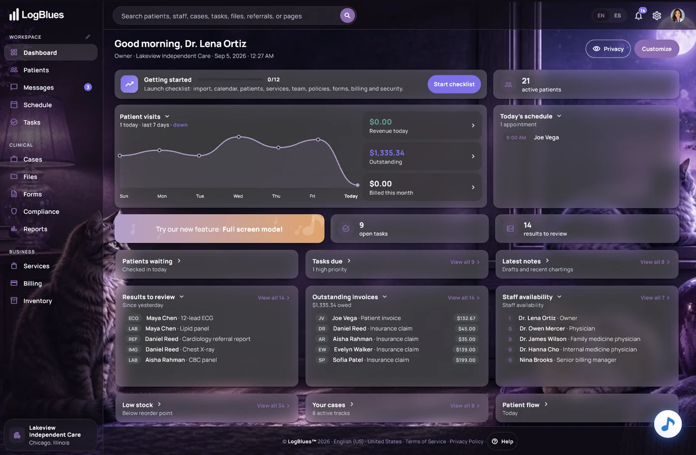
Twenty-one designs, and forty-two if you count dark mode. Every theme ships both ways, switchable in two clicks, and set per person rather than per clinic.
The cards you are looking at are translucent. The artwork sits behind the work and the panels float over it, so a screen full of clinical detail still reads as one calm surface instead of a wall of boxes. It is drawn by our own design team, screen by screen, in a house style rather than a stock component set — which is why a theme changes the mood of the software without moving a single control.